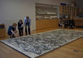
The Jackson Pollock exhibition opened at MoMA this week. As promised, we attended and here is our report.
The assembled collection spans a dozen years of his life and is certainly worth a visit. If you are a Pollock fan, it is a must see.
What struck us most was the fact that some of Pollock's very good work was largely renditions of the works of others. Until he found his own voice and created his masterpieces, he was an effective emulator of the styles of contemporary masters, such as Picasso, Matisse and Dali. To be fair, nearly all artists learn from others and emulate the styles of those who have gone before. The best paintings in the collection are Pollock's drip and paintings. While he drew on the abstraction movement, he neither emulated nor copied. Those masterworks were novel and a leap forward.
The
exhibition is traditional. It follows the long-standing formula of
offering an introduction about the artist, then works are presented in
chronological order with short blurbs about each item. An audio guide
also helps visitors learn about the artist and the artworks. The same
formula has been followed for decades.
There is so much
more to the experience that is being missed, especially with regard to
more recent artists and especially in light of available technologies.
In the case of the current Pollock retrospective, a more engaging
exhibit might include some of the following:
- Instead of a static, passive written introduction and photograph,
why not let Jackson Pollock speak for himself. He gave recorded
interviews that are preserved. What would be more engaging than
actually seeing the artist on a large screen and hearing his words?
- Not only were Pollock interviews recorded, he was filmed while
painting in his Long Island studio. In the case of Pollock's
masterpieces, the painting process--dripping and pouring liquid
paint--is as important as the finished product. Art as an expressive
mental process is one of Pollock's contributions. Why not show it in
action?

- While Pollock likely intended for all of his art to be hung on
gallery and museum walls so that it could be viewed in the traditional
manner, admired and sold, he painted many of his works on gigantic
canvasses on the floor of his studio. So, it would be worthwhile to
place one of his masterpieces on the floor for viewing (well-protected,
of course). Visitors could then better understand how Pollock
approached his canvasses, how he painted and repainted, and how he
viewed the result.
- Another engaging alternative would be to use projection mapping on a
large blank canvas on the floor. The projection would show how the
process progressed toward the finished result--sort of a virtual time
lapse painting demonstration.
- Another gap in the exhibition is the absence of works of other
artists that Pollock emulated. A small black and white image of works that Pollock saw and emulated would put Pollock's work and talent
in perspective.
Of
course, it's easy to say what might be done without considering budget,
space and academic sensibilities, not to mention the expectations of
patrons. Still, modernizing art exhibition at the world's greatest
museums is a worthwhile experiment.
Even without enhancements, the exhibition is worthwhile. We took a few photos to share.
 |
| Stenographic Figure (1942) |
 |
| Gothic (1944) |
 |
| The She-Wolf (1943) |
 |
| There Were Seven in Eight (1945) |
 |
| Shimmering Substance (1946) |
 |
| Full Fathom Five (1947) |
 |
| Number 1A, 1948 (1948) |
 |
| One: Number 31, 1950 (1950) |
 |
| Detail of One: Number 31, 1950 (1950) (lower left quadrant) |
 |
| Detail of One: Number 31, 1950 (1950) (upper right quadrant) |
 |
| Untitled (1951) |
 |
| Easter and the Totem (1953) |
 |
| White Light (1954) |


No comments:
Post a Comment